Interior Design is not just about picking items that look pretty and putting them in a room. In fact, perhaps the most significant element of interior design is mastering the art of perception. When we style we want to make the most out of the space we’re working with, and that’s exactly what these design optical illusions can help you do!
Scale
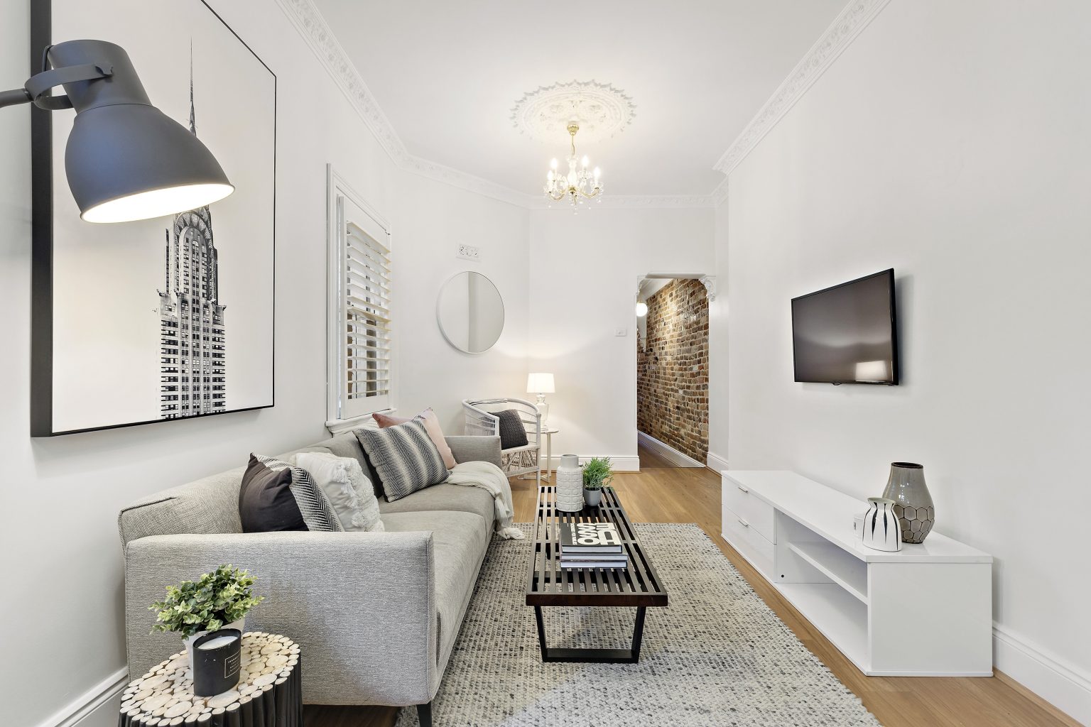
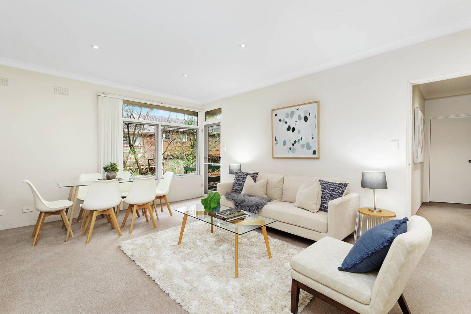
Scale and proportion are very important for any interior designer. It doesn’t matter how beautiful a piece of furniture is, if it’s too big or too small for the room it is going to look awkward. The size and shape of furniture truly has a dramatic effect on a space. When working with a smaller room it’s a good idea to use smaller and thinner furniture, particularly pieces that have defined legs so that there’s space underneath them. When a piece of furniture is lifted off the floor by legs, the added visual of some empty space under your furniture will give the illusion that there’s more space in your room. Alternatively, if you have a large space to work with then large grounded furniture is great for increasing a sense of comfort and creating more defined zones in the home.

Lighting
Did you know that the direction of your lighting influences the look of your entire room? Older homes are beautiful and have character, but they do tend to have lower ceilings which can make things feel a little cramped. Investing in some uplighting can create the illusion of taller walls and higher ceilings by drawing the eye upward as you follow the direction of the light. Other light sources such as table and floor lamps can draw attention to a particular part of the room that you might want to highlight. As a general rule, just remember that the eye follows where the light goes so try to adjust your lighting accordingly.

Mirrors
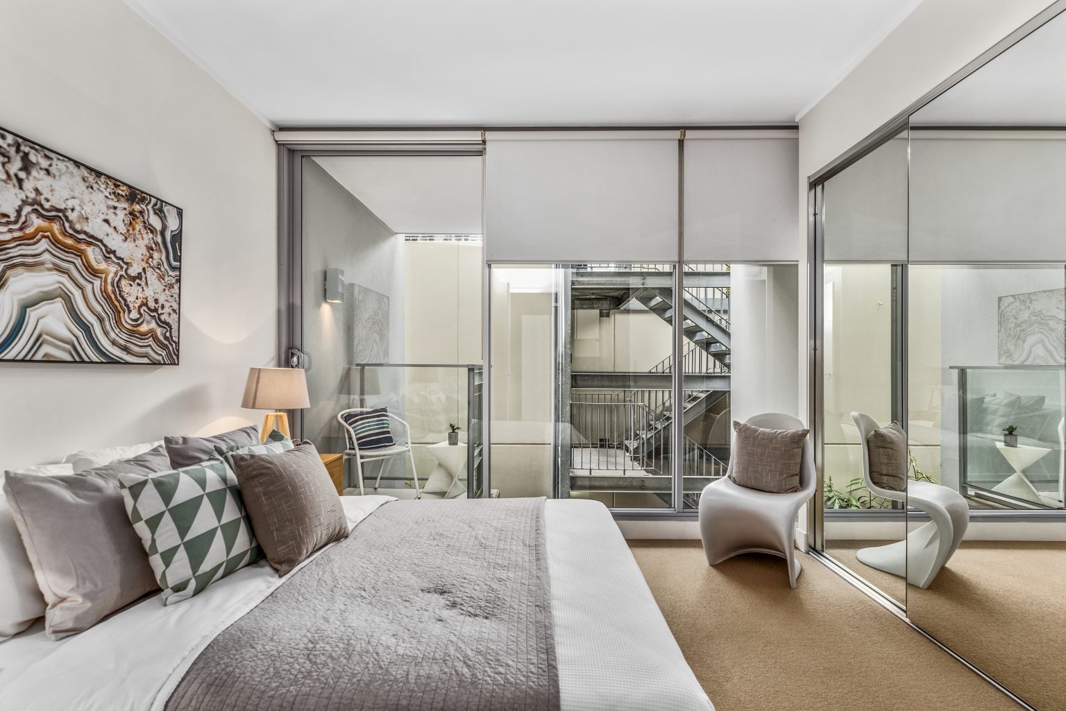
Our last and favourite styling optical illusion is the use of mirrors. A reflective surface is the best possible trick to fool the eye. If you position a mirror at the furthest point from the door in a smaller room, it’ll give the illusion that the room is bigger. The larger the mirror the better this trick works. For example, if an entire wall space is covered by a mirror, someone may even think that the room simply continues on. To add the appearance of height to a room, vertical mirrors are best because they draw the eye up, giving the same visual effect that uplighting can. A combination of vertical mirrors and uplighting will lift the room to new heights!

Contact Us
Vault Interiors Property Styling is in the business of creating higher value spaces in Sydney through vibrant and edgy design. We specialise in unlocking the potential in your property and helping you increase its value through presentation, functionality, and appeal.
Contact us today to get an obligation free quote from a property stylist.
